Challenge: Create an infographic from data tables that have no direct imagery correlation, making the numbers visually quantitative.
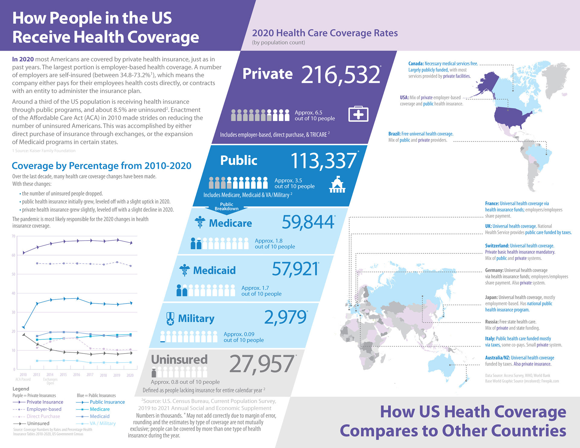
Design: This infographic uses color to highlight the main types of coverage, private, public and uninsured. An analogous color scheme was chosen to relate the coverage types as well as keep the infographic easier to view. The deep purple for private coverage is used behind the main headline, as well as the USA in the map to reference that the majority of Americans receive coverage via private carriers. Blue is used for the public coverage to relate to the governments use of that color for its programs. Shades of purple and blue are used to distinguish subcategories within the main groups. The colors are used in the maps as well to add another layer of color coding by type based on a country's health coverage. The people icons demonstrate the population numbers in visual terms that are easier to understand.
The infographic uses a diagonal divider with the coverage numbers to showcase the USA on the left and the world comparison on the right. The colors are used in a similar way to highlight what type of coverage is being discussed. The diagonal bar, is not only broken out by color-coded types of coverage, but by size of the bar varies based on the number of people utilizing that form of coverage..
Health Care Infographic
Software
Adobe Illustrator
Assets
Original Map: World Bank Base World Graphic Source / Freepik
Data: US Census Bureau, Kaiser Family Foundation, US Government Annual Social
and Economic Supplement, Access Survey, WHO
Team
Graphic Design: Julie W