Challenge: Create a co-branded guide for shared company benefits.
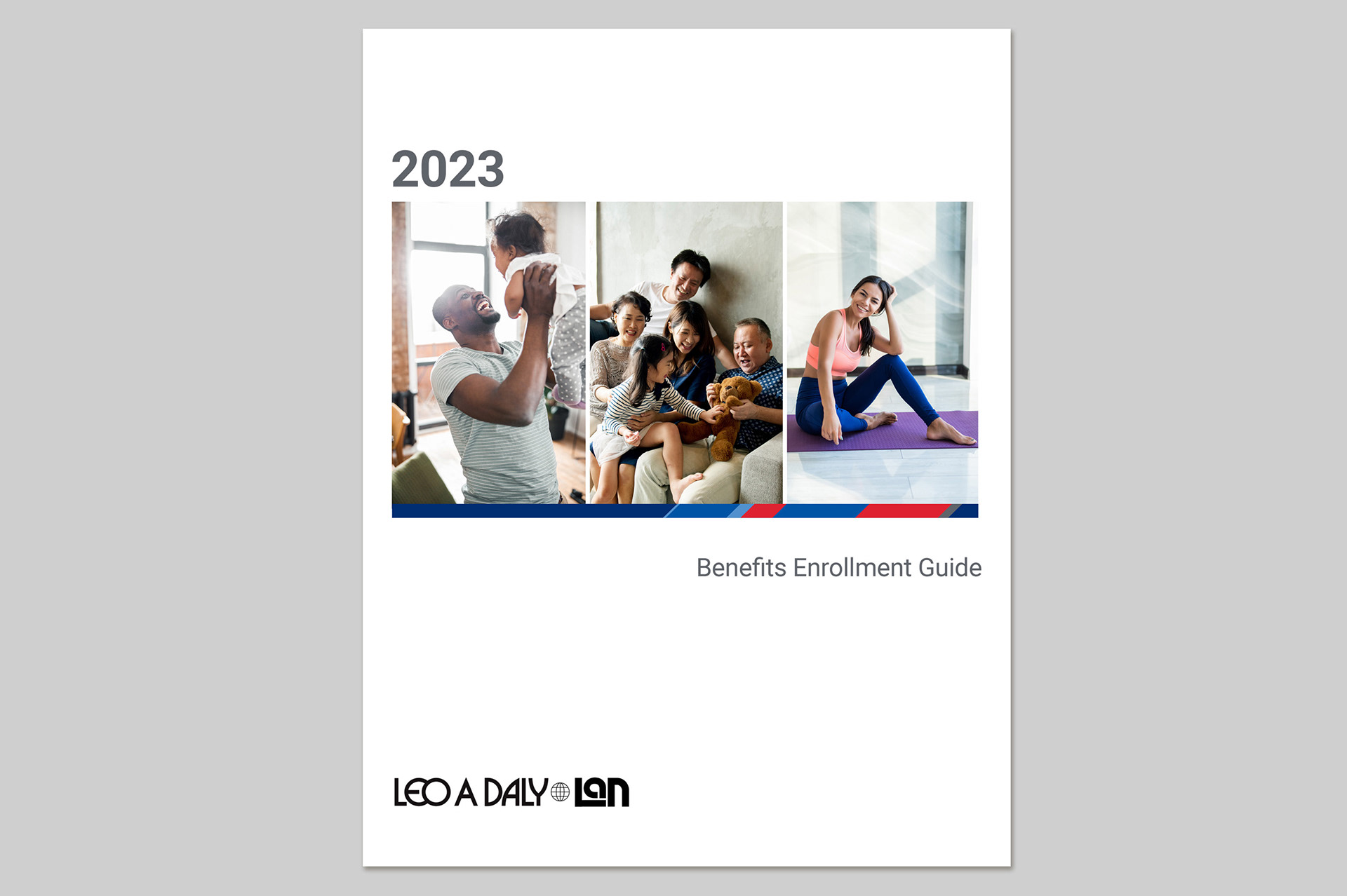
Design: One main challenge was combining two sets of brand guidelines into a cohesive whole. One company has red as their main color while the other one is blue. Both companies had a secondary blue in their palettes, although of different values. A thin bar incorporating the brand colors was chosen to unite the brand standards, and used as a repeating theme in the document. The slanted sections of the thin bar bring movement to the design, and the visual weight of the red and blue colors was balanced by careful selection in the size of the sections.
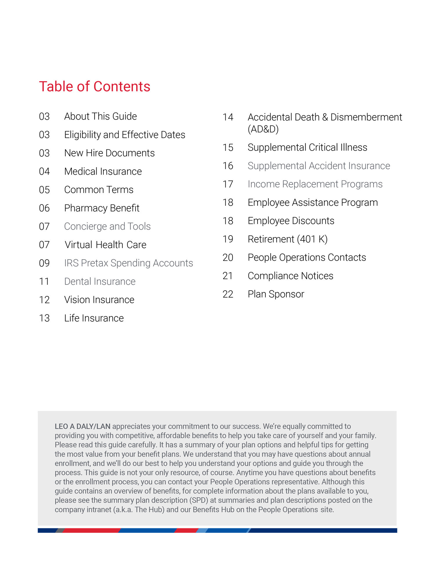
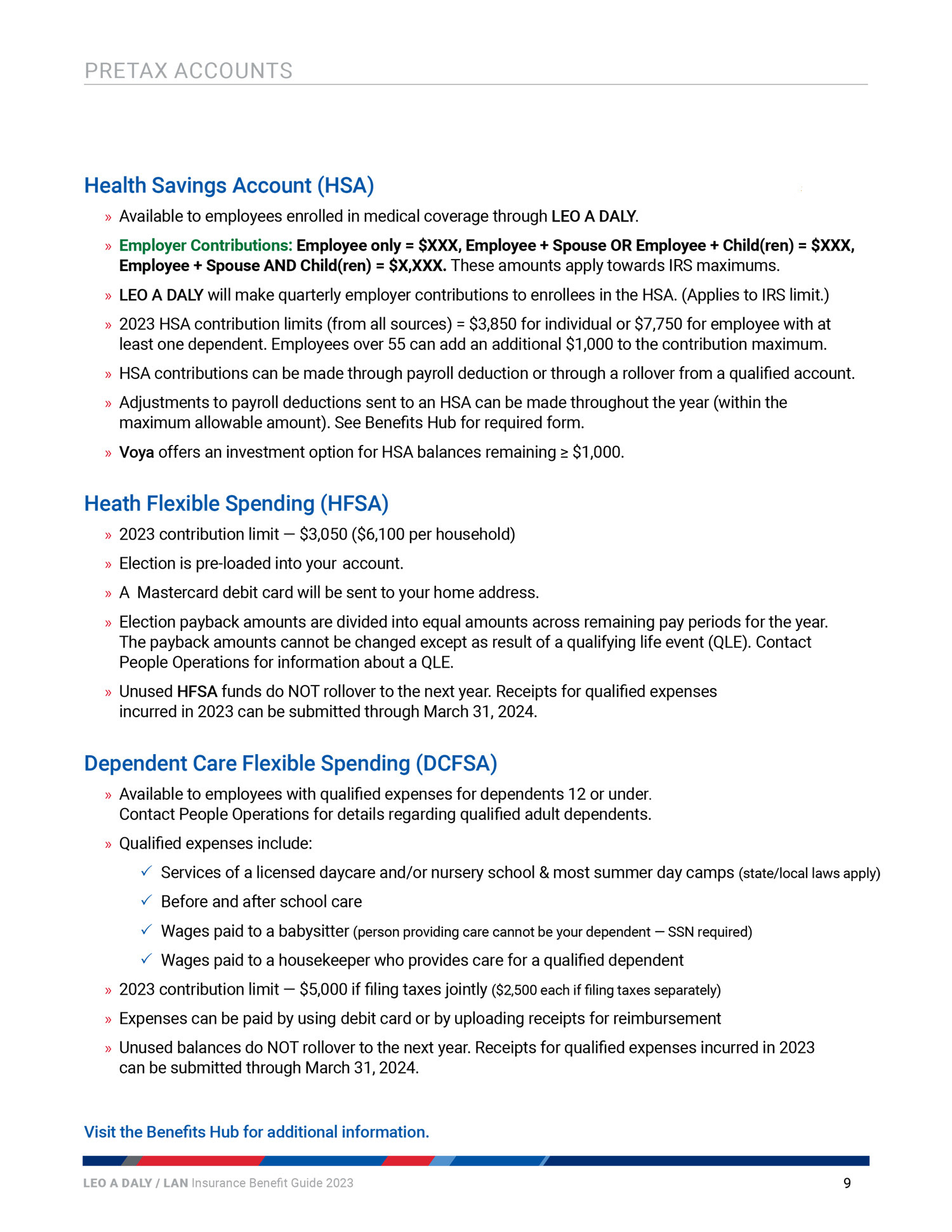
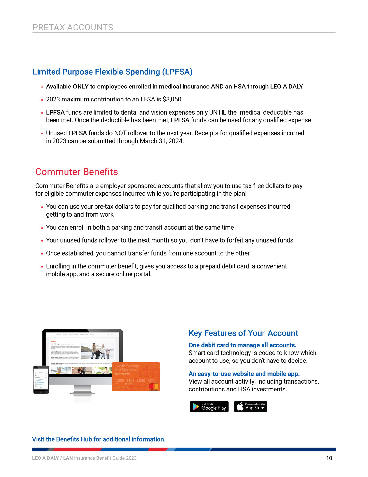
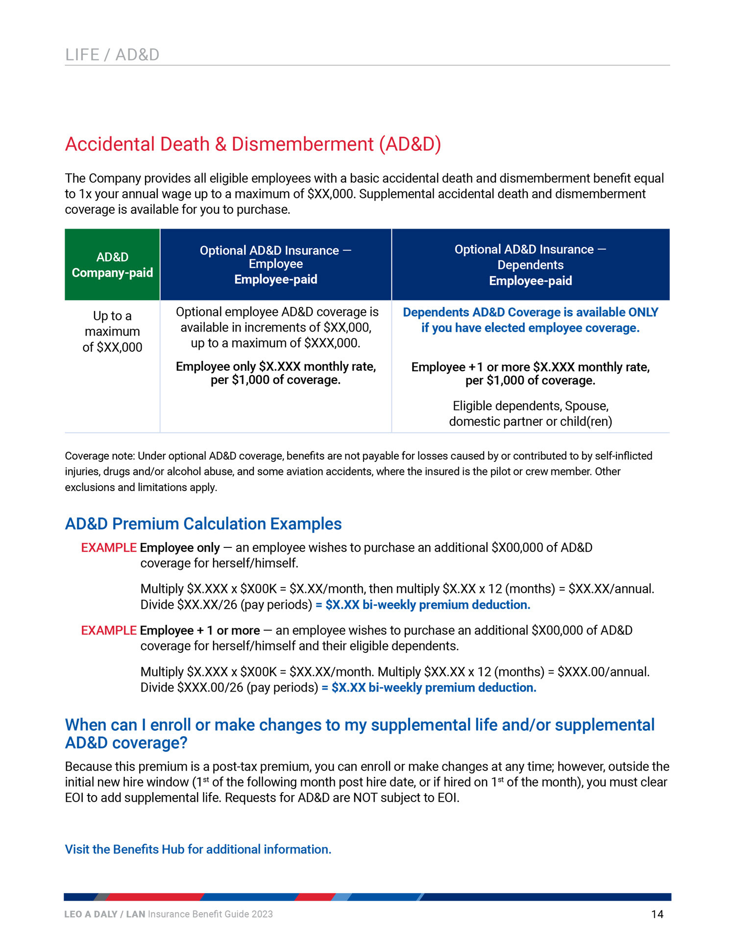
With a large volume of information to convey about various programs, it was imperative to make sure that the information was presented in a simple organized way. Clear headings in red stand out to organize the page topics and indicate when you have changed benefit topics. The blue subheads indicate sections within the main page topic. Tables assist in clarifying plan premiums, and specific coverage information. Hyperlinks were throughout the document, linking both internally and externally as needed for more information.
Alignment: This presentation aligned with the goal of refining the co-brand so both companies felt more represented, and communicating new benefit initiatives to employees. Creating the benefit guide and the presentation in-house allowed for a design catering to the company and its needs, rather than a guide from generic templates. It also allowed for a completely coordinated suite of branded materials to use across all channels.
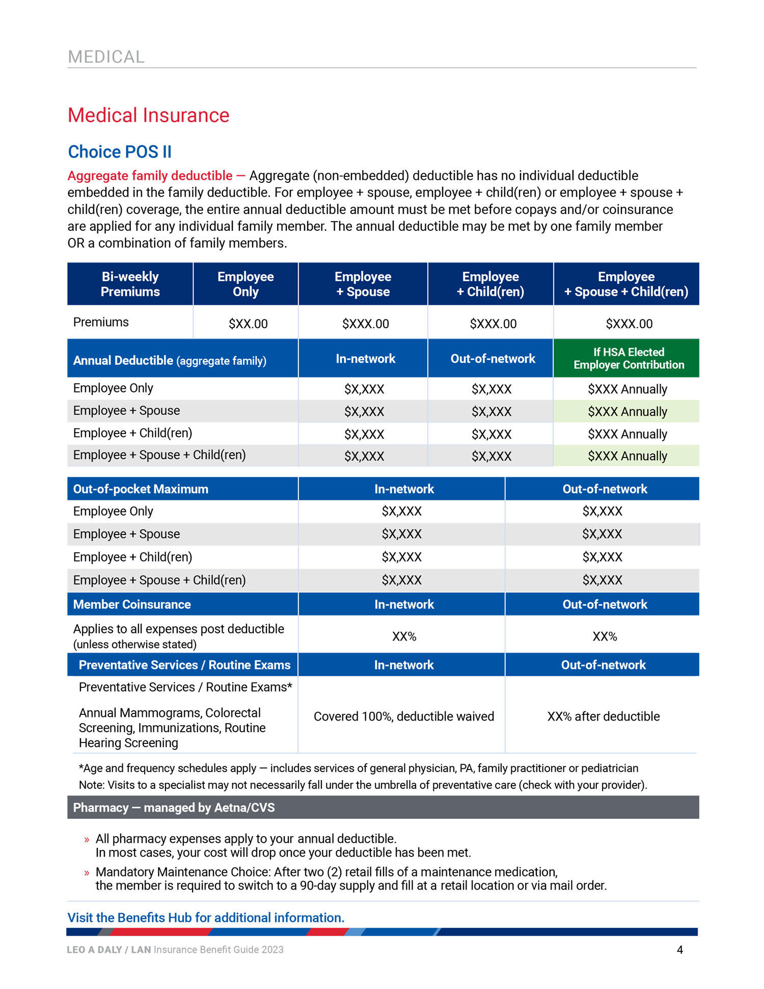
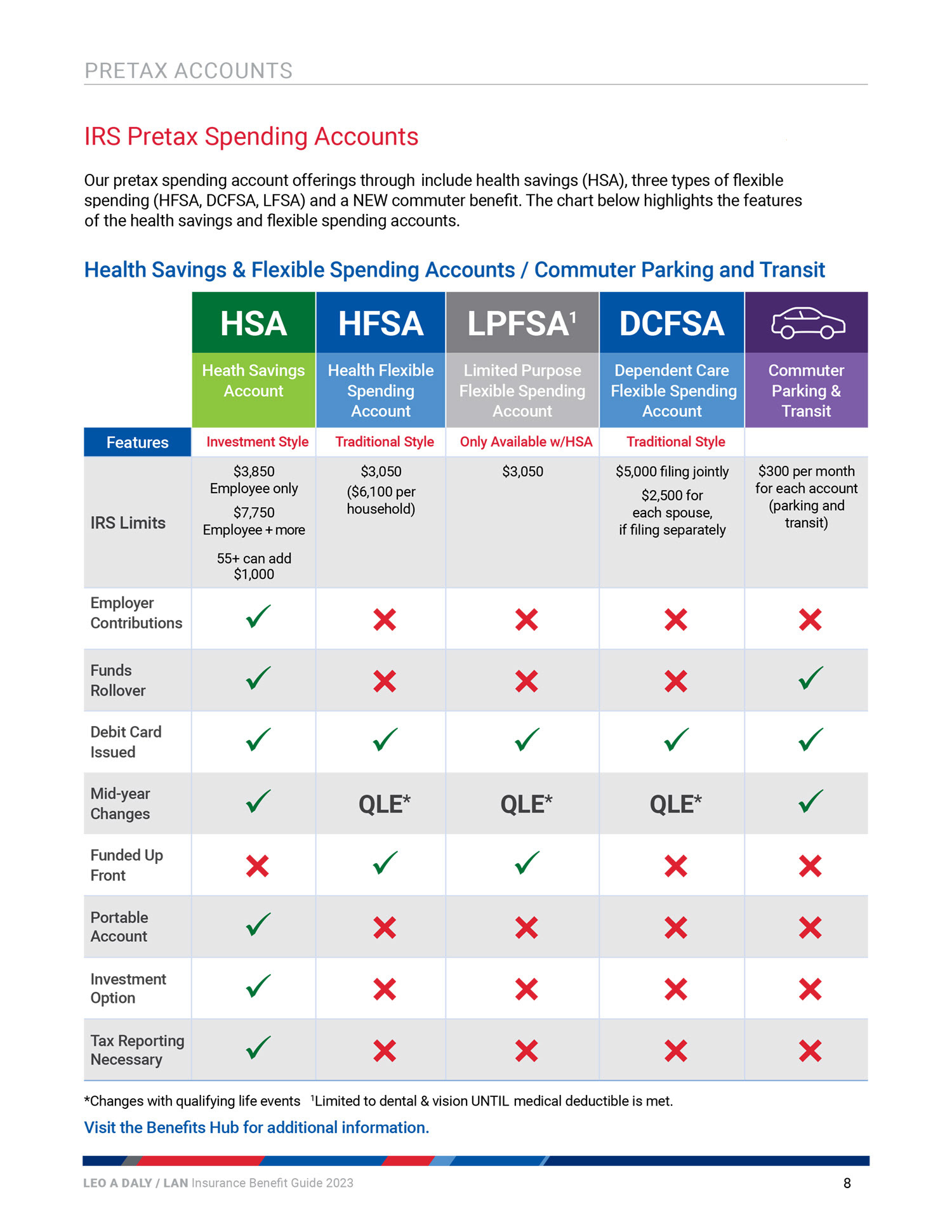
Examples were included to help the employee understand the costs of specific benefits.
Software
Adobe Indesign
Adobe Illustrator
Assets
Shutterstock
Adobe Stock
Team
Graphic Design: Julie W
Leo A Daly People Operations
Company
Leo A Daly