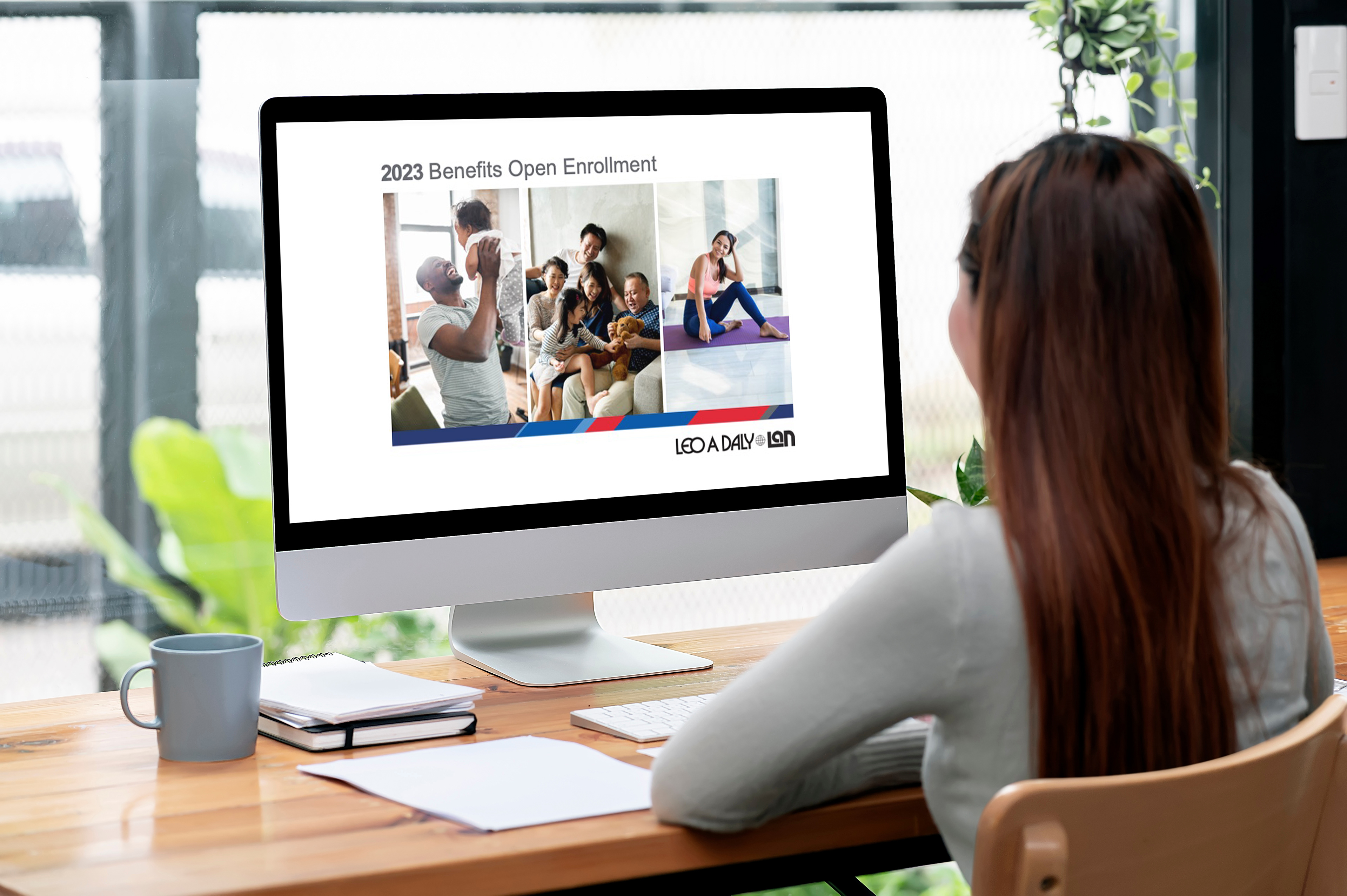
Challenge: Create a co-branded presentation for shared company benefits.
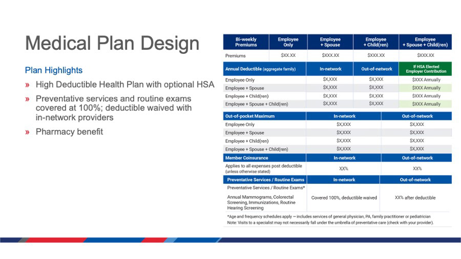
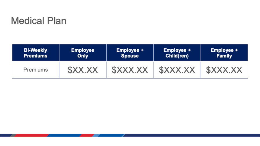
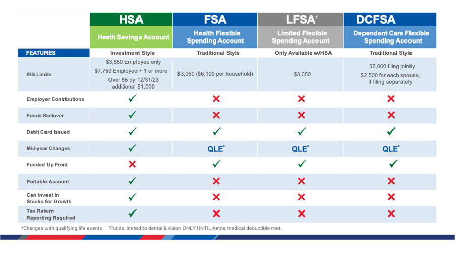
Design: The design follows the corresponding benefit guide in using the co-branded red and blue bar and other similar elements. The presentation was given company wide and put online for reference.
One main challenge was combining two sets of brand guidelines into a cohesive whole. One company has red as their main color while the other one is blue. Both companies had a secondary blue in their palettes, although of different values. A thin bar incorporating the brand colors was chosen to unite the brand standards, and used as a repeating theme in the document. The slanted sections of the thin bar bring movement to the design, and the visual weight of the red and blue colors was balanced by careful selection in the size of the sections.
Alignment: This presentation aligned with the goal of refining the co-brand so both companies felt more represented, and communicating new benefit initiatives to employees. Creating the benefit guide and the presentation in-house allowed for a design catering to the company and its needs, rather than a guide from generic templates. It also allowed for a completely coordinated suite of branded materials to use across all channels.
Software
Adobe Acrobat
Microsoft PowerPoint
Assets
Adobe Stock
Shutterstock
Team
Graphic Design: Julie W
Leo A Daly People Operations
Company
Leo A Daly